Messing Around With Layouts in InDesign
- Feb 1, 2016
- 1 min read
Last week, we were asked to re-layout a MyFonts online newsletter into a booklet. You would've thought it was a simple enough exercise but...

Meet Melle Diete.
Since the original e-newsletter comes in .pdf format, the fastest way to extract pictures is to screenshot them. The problem with screenshotting is, the pic quality usually sucks, so we messed around with Photoshop for a bit.


The next one is about extracting the logo. Naturally, you can screenshot it, but logos are the single most important object you will ever screenshot because they must always, ALWAYS HAVE AMAZING RESOLUTION. So we dabbled around in Illustrator. Select the screenshotted (screenshot... screenshot... what the eff) logo and click on Image Trace > 3 Colors. The logo will look sharper.
If you're nitpicky you can move it to Photoshop or something and re-colour the thing, turn it to RGB/CMYK, remove background using the magic wand tool, etc etc etc.
The next part is kinda boring. In fact, I only took one screenshot.

Re-layouting involves screenshotting images, copy-pasting text, and minuscule editing such as inserting Space Before, Space After, Character Styles and Paragraph Styles.
Believe me, Character and Paragraph styles are fucking lifesaviours. They may only save a few milliseconds each time, but they add up. Plus it improves your mood.
The final look:


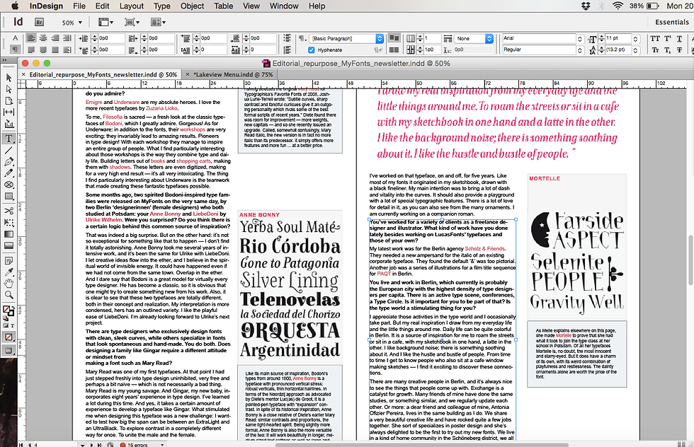


This exercise definitely made me appreciate layouts more. Imagine having to edit whole magazines or catalogues. Plus, there's this feeling you get when your text body snaps satisfyingly on the margin. Ah, the story of being a graphic design student...
Comments