InDesign Exam and Last-Minute Mishaps
- Feb 2, 2016
- 3 min read
Today, for our last Digital Designs class, we had an in-class InDesign exam. We were asked to create a magazine layout for an article called Graffiti Artists Legendaris, originally written by a group called Tim Babyboss (Babyboss Team).
It's also worth noting that it was our first assignment that involved an Indonesian resource, which is a nice change of phase. Now the only thing lacking from the article is a legendary graffiti artist from Indonesia... may I suggest Zaky Muhammad? (He operates in Bekasi and his instagram is @nane21_)
With only three hours on the clock, we had to move quickly.
In the first instruction, we were told to create the headlines in Illustrator. My understanding was we were to use the pen tool to trace and create free lettering or something, so I searched for graffiti fonts in Google Images and traced a few letters to spell out the words "Graffiti Artists Legendaris".


Copy-pasted the given text document and placed them on the layout. Handy tip---instead of splitting them into individual text, just copy paste the whole thing and use the little red + button (pictured below) to redirect the overflowing text.

Since this is a magazine layout, there is no need for cover pages. In the Pages section, click the drop-down menu and select "Allow Document Pages to Shuffle". Then delete the first page to create a symmetrical six-page layout.


Did I mention I love Banksy? I wrote a short review about him for Comping Techniques, if you want to check that out. I had to crop a few of the pictures short, because I wanted them to fit the layout, but that's alright as long as I leave the key parts in.
As you can see, my layout is dominated by pictures, because I think it's much more interesting to read artsy and design articles when they're littered with the real shit. Whatever you have to say about the artist's work shouldn't overshadow what the artist himself expressed in them.


The byline (i.e. the little text that credits the author) requires us to put it in all caps. You could take the easy way and murder your Caps Lock key, or you could do it the pretentious-graphic-designer way and go to Type > Change Case > UPPERCASE. I love how they put that option in all caps, it's a nice touch of humour. Or I'm just really easily amused.

I wanted to change the colour of some of the key words like graffiti, street art and graphic design. What you do is go to Edit > Find/Change or just Command + F. I love this Command + F thing because it sounds like giving a military salute with your middle finger. ANYWAY. This feature is a bit flawed since it doesn't select all of the wanted words, you kinda have to go manually and click Find Next again and again.

To change colours, use Character Style, found under Type. Highlight the text effects, click Create New Style, and so on. The same works for Paragraph Style, except of course this applies to paragraphs and as such, even if you merely click anywhere on that paragraph, it will still affect the whole thing.


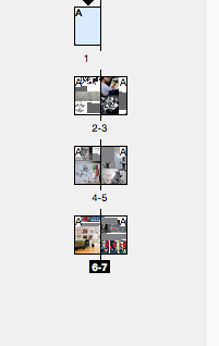
An overview of my layout. Some of the images are absurdly big but hey, that's part of the appeal. Also, you have to include two images with their backgrounds removed, as you can see in Page 3 and 6 (that was totally last minute).

Another last minute change I did was the headline. I know I probably defied instructions right there but I just absolutely hated the first one, which was a free-lettering font. Since I didn't have time to trace a new typeface, I just went with the most grunge in my font collection, BlackCasper. The rest of the fonts are Avenir Book and Avenir Heavy. It's interesting how Avenir chose to label its bold and italics under the terms "Heavy" and "Oblique". Avenir, you little rebel you.
So there you go. I didn't exactly follow the instructions but hell, I'd be a lot sorrier if I kept that ugly-ass headline, so be it. And technically I followed half of the instructions... it was done in Illustrator.

Digital Designs has been quite a journey. Aside from learning how to operate Adobe Illustrator, Photoshop, and InDesign, I learned the merits of updating your blog regularly, the importance of having back-ups (three flash disks are the standard minimum), and how to keep your shit together when it's 1 am but you still have to print seven stamp layouts. But that's another story...
Comments