Creating Maze Fonts
- Feb 6, 2016
- 2 min read
For our final assignment, we were asked to create our own font, along with a booklet and poster to display it. I wanted to make a font that had something to do with puzzles and/or mazes, since that's a topic I touched frequently this term. If you remember, for our first assignment I created five fonts based on the devolution of creativity and inspired by mazes, and for the second one I created a Rubik's cube installation. It's only logical to create a font that has something to do with our previous assignments, as a climax to the term-long study on mazes and puzzles.


Since my font is going to be largely inspired by the Bauhaus fonts, I knew I had to create it digitally, to maintain the straight lines and perfectly rounded curves and whatnot. This was all done in Adobe Illustrator.
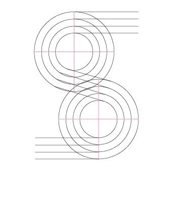
For each font, I created a template. Then, using the Pen tool, I traced each letter on a seperate layer, and added little dividers and "holes" to create a maze-y look.


Some of the letters are straightforward enough...


And some are just murder, such as this E...

I couldn't figure out how to make sure the tail and bowl doesn't overwhelm each other.
Other difficult letters included the S and the Z. At first I had a hard time figuring out the balance. How do you make the shape consistent? How do you not make the curve flat? Does this look like a man on his knees or a pretzel? I must have spent at least an hour on those two letters alone.


Most of the letters required some fine-tuning. I went in with the Direct Selection tool for the clean-up.

The "Scale Strokes & Effects" is repeatedly checked and unchecked during the process. When I want to move a letter from one document to another, I have to turn it on. However, when I am creating the template and I want to stretch a line whilst still keeping its stroke width intact, I have to turn it off.

After two revisions, this is the final compilation:

Stay tuned to see the fonts used in a poster and booklet!
Comments