IDENTITY - Self-Branding Community Project
- May 27, 2016
- 4 min read
For my final assignment, I wanted to create something very different than your average posters and paintings. Go big or go home, that's my motto.
One of the first things that strikes me about the New York School is its diversity. In fact, at first it was quite hard to research about the NYS because there were so many components---you can find its influences in editorial design, advertising, branding, fine arts, music, et cetera et cetera. There was one point where I broke down and cried to my friend until 3 am in the morning because I was so overwhelmed. It was a full-blown panic attack, and I don't get those often. So, it was definitely a monumental moment.
Anyway, the diversity isn't only reflected in its graphic design aspect, but also its cultural aspect. Researchers say that art reflects the people's mindset in that era (though Oscar Wilde proudly rebutts this). Analysing magazine covers and advertisements of the 1930s-1970s, I found quite a few interesting themes, but the one that stuck in my head was identity.
During the NYS era, people were starting to pay attention to its audience. Before, advertisements were largely flashy and hard-selling, i.e. the designers assumed that everyone wants the same thing, which is fame and luxury and extravagance. One size fits all, you could say. However, during the NYS era, designers started to actually listen to what their customers wanted. Take the Volkswagen "Think Small" campaign. It's pratically saying, "This is inexpensive. It's efficient. It's pratical. It's what YOU need, nay, it's what you WANT. You don't need shiny expensive cars when you can get one that works just fine to suit your daily needs." The "Think Small" campaigns were targetted at middle class and upper middleclassmen, those who could afford cars but have no need to be luxurious. It even brands luxury and extravagance as stupid, almost.
Another great example of this is Cipe Pineles' magazines. The NYS took place in an era where people were starting to be conscious of social equality---women's and black people's rights, for example. Furthermore, New York City was and still is one of the biggest melting pots for many different cultures, races and heritages. This was reflected well in the NYS designs, with DDB's "You Don't Have to be Jewish to Love Levy's" campaigns and Cipe Pineles' efforts to change the role of women and young girls in society through her publications.
Furthermore, the NYS was an era where branding and corporate identity started to flourish in America, thanks to Paul Rand. He essentially also changed the identity of graphic designers working in the USA. Before, they were merely hired hand---people you employed to fill in designated spaces in your advertisement or text or whatever. Thanks to the NYS, graphic designers became an integrated part of any business and production. It's unquestionable. You want to create something, design HAS to be a part of it. We are here today thanks to the NYS.
So in the end, I chose identity as my key word for New York School. Because it happened in an era where America was realising its identity (or many identities), and that is reflected well in NYS works.


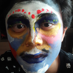


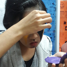


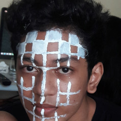
I'm a people person, so I knew from the start that I wanted to involve the community in my project. I asked my friends to paint a visual interpretation of themselves, or their "identities", on their faces, and I would film about 10-20 seconds of it. Why go for the face? Because it's the first thing people focus on when they meet you. The face is direct and allows for great dynamic. Plus, painting your face is more attention-grabbing than painting, say, your hand or something.
A lot of the members are UIC kids, including my classmates, kids from other batches, and even a lecturer. The rest are the friends I hung out with in middle school and high school. Surprisingly, they reacted with great enthusiasm---I was worried that some may find it "too hard" or "too complicated" or will simply not participate because, well, fucking egos. And there were a few people like that, but more people chose to participate than not! I think it's also because, especially the graphic design students, people wanted to prove themselves in the eyes of others---and what better opportunity to do that?
Behold! My snapchat story during Day 1 of Filming:
Final thoughts? It was pretty damn incredible. Everyone loved it when I showed them the video in my final presentation---there were lots of laughs and table-banging and ceiling-destroying... well maybe not that last one but it felt pretty damn AWESOME. I also think this has got to be one of my awesomest projects ever.
If I could change one thing, I'd probably film it landscape---so there's no awkward transition between the title sequence and the showcase. Also, I'd involve more people.
My mentor once said that I'd be perfect for social campaign, and thinking back to this I think she may have a point. I do love working with people, and I think this project, aside from delivering for the New York School, really got me closer to the community. I learned how to approach people and convince them to take part in my project. Hey, maybe I can be the next George Lois!
My final presentation, including timeline, book, research, and artwork:


All in all, I'm very happy with how this class has turned out. I started out being quite scared and doubtful---I didn't know if I could get a good score, especially since Contextual is like, the deadliest class since no more than two people in the history of UIC has gotten a Distinction in it. However, as I worked on the film and research, I found myself caring less and less about scores and more about the actual outcome of it. Regardless of the score I get, I think I have proven myself to be capable of reading between the lines, creating analysis and thinking out of the box.
I'm definitely looking forward to creating more community projects in the future. Here's to the people, and here's to the end of term (and return of sleep!)
Comments