(More) Process Screenshots and Midnight Rambles
- Jun 1, 2016
- 2 min read
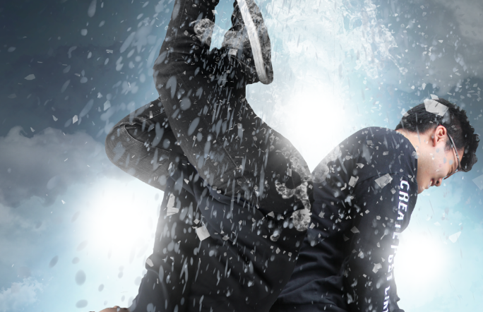
The Insurgent movie poster must've been a lot of work. You have backgrounds to deal with, intense lighting, yadda yadda. I wonder how much they spent on that alone, and how much of it was Photoshopped. Do you think they actually took pictures of clouds, or was it obtained from the internet, or was it digitally-conceived?


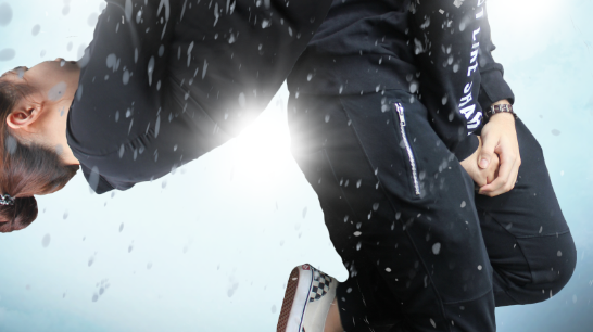
A close up of that spilling water brush. At some point I decided it would be funnier (and easier) to replace the shattering glass with spilled water. You know, to emulate pees and poos and toilet flushing and, well, you get the idea.
Why the fuck is Kelvin smiling.

Cover that crotch up.

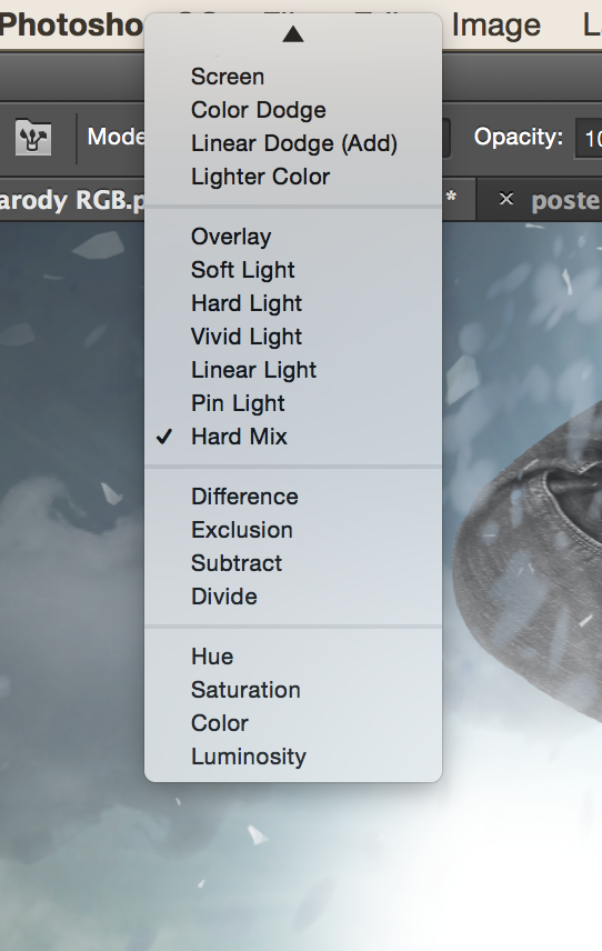
Tried playing around with the colours. The original movie poster is a bit yellowish, though the one below is kinda green.

I feel like I should comment on this but I don't know what to say. For once, Raras is speechless.

This is what it looks like with a few more touch-ups.

In case you're wondering, I think I used Lens Flares by Artistmef, though it comes in a series of five and it could be one of the others.

Looooook at that vector. Nice and sharp. The high-res Kelvin has started to break but oh no, the vector stays sharp. It's raising a middle finger to all of you.

The brief said to "take screenshots of defining moments" or something like that but c'mon. Appreciate the little moments. Still trying to get that neon strobe right:

This light ray is right on the butthole. Now I call that art.

The original poster was very... defined. Cheekbones, muscles, ears, I swear they probably even went through each and every finger bone. In this case, let's give Kelvin a contour job using the Burn and Dodge tools.

Working on the credits.

Heebie-jeebies. Everyone likes Theo James but I think his face looks sort of stupid, to be honest. It's a Channing Tatum face. They're too aware of the camera.

Look! A top hat!
Seriously though, the things I choose to screenshot...

Shower away.

Prototype 1, RGB:

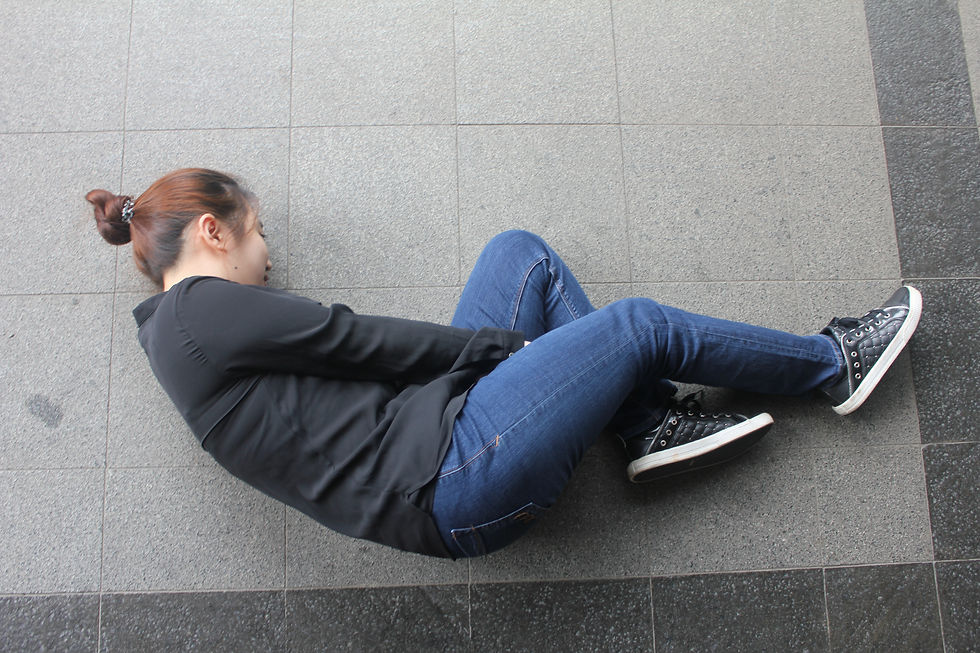
Just in case you're wondering, here are the original pics:


Comments